You’ve spent weeks maybe months building your website. The design looks clean, the branding feels tight, and your product or service is genuinely great. But people visit… browse… scroll… and then?
They leave.
No purchase. No signup. No inquiry.
Frustrating, right?
Here’s the truth most people miss: traffic isn’t the win. Attention isn’t the endgame. Getting people on your website is just the beginning. What actually matters is whether they take action.
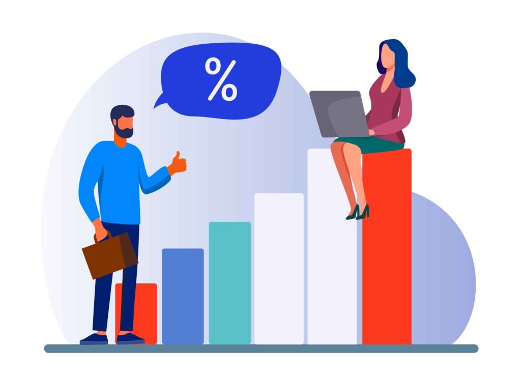
And that’s exactly where Conversion Rate Optimization (CRO) comes in.
This guide cuts through the fluff and gives you the practical, high-impact ways to increase conversions using psychology, design, and data—not guesses.
What CRO Actually Is (And Why It Matters More Than Traffic)
Conversion Rate Optimization (CRO) is about increasing the percentage of visitors who take a meaningful action—buying, signing up, filling a form, booking a call, etc.
But CRO isn’t just about boosting numbers. It’s about squeezing more value from the traffic you already have. No extra ad spend. No extra SEO grinding.
Let’s say your site gets 10,000 visitors a month:
- At a 1% conversion rate → 100 actions
- At a 3% conversion rate → 300 actions
Same traffic. Triple the results.
That’s the power of CRO.
But it doesn’t happen by accident—you need clear data, smart design, and user-focused thinking.
Step 1: Understand What’s Really Happening on Your Website
You can’t fix what you can’t see.
Start by analyzing real user behavior using tools like:
- Google Analytics
- Hotjar
- Microsoft Clarity
Look for:
- Pages where users bounce
- Points where they hesitate
- Where they scroll and stop
- Which elements people ignore
Choose one goal at a time—“increase demo bookings by 20% this month” beats vague aspirations.
Behind every bounce is a reason. Behind every hesitation is doubt. And behind every conversion drop is friction you can remove.
Step 2: Make Navigation Ridiculously Simple
No one wants to fight with a website.
If users can’t find what they want quickly, they’ll leave—fast.
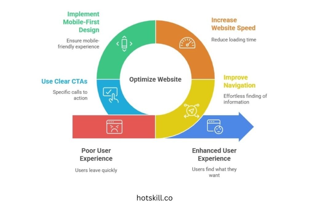
Fix the basics:
🧭 Navigation should feel effortless
- Everything important within 2–3 clicks
- Clear menu structure
- Logical categories
- Breadcrumbs to avoid confusion
⚡ Speed matters
A one-second delay = up to 7% loss in conversions.
Use GTmetrix or Google PageSpeed Insights to find bottlenecks. Compress images, remove unnecessary scripts, optimize loading.
📱 Mobile-first design
Half your visitors are on mobile. Make sure:
- Buttons are thumb-friendly
- Menus are clean
- Text scales properly
🟢 Clear and specific CTAs
“Submit” means nothing.
“Get My Free Guide” or “Book Your Free Consultation” converts.
Simple changes = big impact.
Step 3: Make Content + Design Work Together
Pretty design alone won’t convert. Brilliant copy buried under clutter won’t either.
They have to work as a team.

🎯 Headlines that communicate value
Lead with results:
- “Double Your Leads in 30 Days”
- “Get Legal Help in Under 10 Minutes”
People won’t scroll if they don’t understand the benefit immediately.
🙋 Show trust, upfront
Use:
- Customer testimonials
- Press mentions
- Case studies
- Guarantees
- Certifications
Trust is conversion fuel.
📸 Visuals that clarify
Instead of just describing, show:
- Explainer videos
- Product demos
- Before/after examples
- Feature animations
And test everything: the hero section, CTAs, images, layout. One insurance brand moved their form above the fold and saw 24% more leads—same day.
Step 4: Build Trust—Fast
Distrust kills conversions faster than anything else.
Here’s how to build confidence instantly:
- ⭐ Use real customer reviews (preferably with faces)
- 🛡 Highlight guarantees, refund policies, safety nets
- 🔐 Show security badges and SSL trust signals
When people feel safe, they move forward.
Step 5: Simplify the Conversion Path
Your form or checkout shouldn’t feel like applying for a passport.
✍️ Reduce form fields
Ask only what you need.
You can always gather more later.
💳 Offer flexible actions
Give users options:
- Multiple payment methods
- “Book a call” instead of “Fill 12 fields”
🎛 Use multi-step forms
Breaking long forms into steps (with a progress bar) reduces psychological load.
Every extra field is a chance to lose someone. Make it smooth.
Step 6: Personalize Without Being Creepy
People engage more when something feels built for them.
📊 Segment your audience
Speak differently to:
- HR managers vs founders
- Parents vs students
- Beginner vs advanced users
Each group has different motivations.
🔁 Smart retargeting
Show users what they viewed or abandoned—with subtle nudges, not aggressive pressure.
🤖 Recommendation tools
Quizzes, product filters, and tailored suggestions boost conversions instantly.
One skincare store added a 3-question quiz and saw a 38% jump in conversions.
Guidance works.
Step 7: Use Social Proof, Urgency & FOMO (Ethically)
People follow signals.
📈 Social proof popups
“Anil from Mumbai just bought XYZ.”
These work because they show real-time activity.
🕑 Time-based urgency
- Limited-time bonuses
- Countdown timers
- Deadline reminders
📉 Real scarcity
Only if it’s genuine. Fake urgency destroys trust.
Done right, these boosts create momentum—not manipulation.
Step 8: Test. Adjust. Refine. Repeat.
CRO never ends. Trends change. User behavior evolves. Competitors shift.
Make testing a habit:
- A/B test headlines
- Experiment with CTAs
- Try new landing page structures
- Move or redesign forms
- Test videos vs images
Analyze → adjust → re-test → scale.
Your website should evolve the same way your business does.
Final Thoughts: Clarity Converts. Confusion Kills.
At the core, CRO is simple:
Every change you make should answer one question:
“Does this make it easier for someone to say YES?”
Great CRO feels natural. Smooth. Human.
People shouldn’t feel pressured. They should feel guided.
So keep iterating. Keep testing. Keep removing friction.
Small improvements stack up. And before you know it, those “scroll and leave” visitors start turning into buyers, leads, and loyal customers.
Happy optimizing—your conversion breakthrough might just be one tweak away.